Are you stocking bulbs based on looks alone, only to find designers ignoring them? Losing high-value projects because your inventory doesn't meet professional standards is a silent profit killer.
Professional designers choose LED Edison bulbs by balancing three key elements: ambiance (color temperature and rendering), function (dimming and layering), and form (scale and shape). They treat bulbs as precision tools to create a specific emotional experience.

As the Marketing Manager for Omita, I spend a lot of time talking to the people who specify lighting for major projects—the interior designers. While my direct customers are buyers and product managers like Jacky, understanding what their customers want is key to our shared success. A designer's process is much deeper than just picking a "cool-looking bulb." They have a checklist that separates professional-grade lighting from the rest. Knowing this checklist will help you stock the products that get specified for high-end residential and commercial jobs, making you a go-to supplier for the pros.
What Do Designers Prioritize Beyond Just the "Vintage Look"?
Are your highest-quality bulbs being passed over for cheaper options? You might think price is the only factor, but for designers, technical failures are not an option.
Designers prioritize technical performance that creates the right mood. They demand high CRI for true colors, specific CCT for desired warmth, and absolutely flicker-free dimming to ensure a flawless user experience.

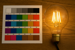
For a professional designer, a light bulb is an instrument, not just a decoration. The "vintage look" gets their attention, but flawless technical performance wins them the job. I had a conversation with a hospitality designer from the UK who was designing a new chain of boutique hotels. He told me, "Wallson, a single flickering bulb in our lounge can ruin the guest experience and lead to a bad review. We can't afford that." This highlights their priorities. First is the Color Rendering Index (CRI). A CRI below 90 is a non-starter. They need to know that the expensive fabrics, rich wood finishes, and fresh food will look exactly as intended and not washed out or off-color. Second is Color Temperature (CCT). They don't just ask for "warm white"; they specify 2200K for an intimate, candle-lit feel in a bar, or 2700K for a clean but cozy warmth in a living room. Now, many are demanding "Dim to Warm" technology, where the light gets warmer as it dims, perfectly mimicking old incandescent behavior. Third, and perhaps most critical, is dimming performance. It must be smooth, deep, and compatible with professional systems like Lutron or Crestron without any flicker or "pop-on." As a manufacturer, we invest heavily in our driver technology and provide compatibility charts because we know designers see a bulb that flickers as a fundamental product failure.
Professional vs. Standard Bulb Specifications
| Feature | Standard "Consumer" Bulb | Professional Designer Requirement |
|---|---|---|
| Color Rendering (CRI)1 | 80+ | 90+ (Non-negotiable) |
| Color Temperature (CCT)2 | "Warm White" (2700K-3000K) | Specific Kelvins & Dim-to-Warm |
| Dimming | "Dimmable" (Often flickers) | Smooth, Flicker-Free, Deep Dimming3 |
| Lifespan/Consistency | Basic L70 standard | Tight Binning, Color Consistency, Long Life |
How Do Designers Layer Lighting with Edison Bulbs?
Do you see designers buying only a few Edison bulbs for a huge project? This isn't a small sale; it's a sign they are using them as a specific tool.
Designers use Edison bulbs almost exclusively in the "decorative layer" of their lighting plans. They are not for general illumination but act as visual "jewelry" to create focal points and mood.

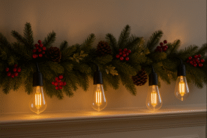
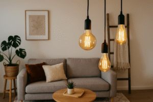
A common mistake is thinking Edison bulbs should light up an entire room. Professional designers never do this. They build lighting in three distinct layers, and Edison bulbs have a very specific, starring role. The first layer is Ambient Lighting: this is the workhorse light, the general, foundational illumination that makes a space usable. It often comes from hidden sources like recessed can lights, cove lighting, or large, simple ceiling fixtures. The second layer is Task Lighting: this is tightly focused light for specific activities like reading, chopping vegetables, or applying makeup. It's provided by under-cabinet lights, desk lamps, or vanity fixtures. The third, and most important layer for our topic, is Accent or Decorative Lighting. This is where the LED Edison bulb lives. It’s the "wow" factor, the functional sculpture. Designers don't use it to light the room; they use it to draw the eye, establish a style, and create an atmosphere. Think of a trio of ST64 bulbs in simple cord pendants over a kitchen island. They aren’t there to light the whole kitchen (the recessed lights do that), but to create an intimate, stylish zone. It's the visual centerpiece, the conversation starter. Understanding this helps you guide your clients to use them effectively for high impact.
What Are the Biggest Mistakes Designers See Clients Make?
Do your customers install Edison bulbs everywhere, creating a chaotic look? Guiding them on proper application can build trust and establish you as an expert supplier.
The biggest mistakes are overuse, improper scale, and ignoring ambient light. Amateurs put them everywhere, creating a cluttered "theme-park" effect, while pros use them selectively to create sophisticated accents.

I often ask my designer contacts what problems they end up fixing. Their answers are very consistent and reveal the gap between amateur enthusiasm and professional execution. The most common error is overuse. A client loves the vintage look and puts Edison bulbs in every socket, from the ceiling fan to the table lamps. The designer's first job is often to remove half of them. The effect should be a curated accent, not a relentless theme. The second major mistake is ignoring scale. A designer told me about a client who put a beautiful, large G125 (also known as a G40) globe bulb in a tiny glass bedside lamp fixture. It looked like a balloon about to pop and created terrible glare. Conversely, they'll use a tiny G45 bulb in a grand, high-ceiling entryway, where it gets visually lost. Designers masterfully match the bulb's size and shape to the fixture's proportions and the room's volume. Lastly, clients often rely on Edison bulbs as their only light source. This results in a room that is dimly lit, full of shadows, and has harsh glare points from the exposed filaments. It's uncomfortable and impractical. A professional knows the Edison bulb is the final, beautiful touch, not the foundation.
Common Mistakes and Professional Solutions
| Amateur Mistake | Why It's Wrong | The Professional Solution |
|---|---|---|
| Overuse4 | Creates a visually chaotic, theme-heavy look. | Use selectively as focal points (e.g., one chandelier). |
| Improper Scale5 | The bulb looks out of proportion with the fixture/room. | Match bulb size to fixture size and room volume. |
| Sole Light Source6 | Results in poor general lighting and glare. | Layer with ambient and task lighting first. |
How Does Budget Influence a Designer's Choice of Bulb?
Do you think designers only buy the most expensive option? The reality is they must balance project budgets, making them seek the best possible value and reliability.
For designers, "budget" is about risk management, not just the lowest price. For high-end jobs, they'll pay for flawless performance. For others, they seek a reliable "sweet spot": a bulb with high-quality tech at a reasonable price.

Every project has a budget, and a designer's reputation depends on managing it well. Their bulb choice is a calculated decision based on the project's profile and managing risk. For a luxury hotel or high-end residence7, the budget for lighting is higher, but the expectations are absolute. The total cost of ownership8 is key here. The cost of a single bulb failing—requiring a maintenance call, disappointing a VIP guest, or not dimming with the expensive control system—is far greater than any initial savings. Here, they will specify only the best: CRI 95+, perfect "Dim to Warm" functionality, and proven drivers. There is zero room for error. For a trendy restaurant, cafe, or mid-range commercial project9, the calculation changes. This is the sweet spot where a company like Omita excels. The designer needs a high-quality aesthetic and reliable performance but must be more cost-conscious. They will look for the best value: a bulb with CRI 90+, great dimming from a trustworthy manufacturer, all at a reasonable price. They cannot afford the callbacks from cheap, flickering bulbs found on consumer marketplaces. This is where a reliable partner like us becomes indispensable. They are buying peace of mind and performance on a budget.
Conclusion
Designers merge art with science. By understanding their technical needs and providing high-quality, reliable bulbs, you become their trusted partner, not just another supplier on a list.
-
Understanding CRI is crucial for selecting the right lighting for design projects, ensuring accurate color representation. ↩
-
Exploring CCT helps in choosing the right ambiance and mood for spaces, essential for professional design. ↩
-
Learning about advanced dimming options can enhance lighting quality and user experience in professional settings. ↩
-
Understanding the impact of overuse can help you create a balanced and aesthetically pleasing space. ↩
-
Choosing the right scale is crucial for harmony in design; explore expert tips to enhance your space. ↩
-
Learn why relying on a single light source can compromise your room's ambiance and functionality. ↩
-
Explore this link to understand the unique lighting needs and budget management for luxury projects, ensuring top-notch quality and performance. ↩
-
Learn about the importance of total cost of ownership in lighting decisions, helping you make informed choices that save money in the long run. ↩
-
Discover insights on balancing aesthetics and budget in lighting for trendy venues, crucial for attracting customers and enhancing ambiance. ↩