You select high-quality fixtures for a project, but the finished space still feels "off." The atmosphere feels cold, sterile, or even anxious, and you can't figure out why your lighting choices aren't working.
Yes, the color of light directly impacts human psychology and mood. Warm tones like 2700K promote relaxation, while cool tones like 4000K increase focus. This is called color psychology, and it's a vital tool for designing effective spaces.

I'll never forget a conversation with a product manager from a large American hospitality chain. They were getting feedback that their new hotel lobbies, despite being beautifully decorated, felt "unwelcoming and stressful." They were using standard 4000K bulbs everywhere for a "clean, modern look." I explained that 4000K light mimics midday sun, signaling our brains to be alert and productive—the opposite of what you want when a weary traveler checks in. We sent them samples of our 2700K filament bulbs. The change was immediate. The warmer light created a cozy, safe haven. This experience proved to me that for my customers, understanding how light feels is just as important as how it looks. It's not just about lumens and watts; it's about human emotion.
Why Does "White" Light Feel So Different From Room to Room?
You think all "white" LED light is created equal, so you stock a standard bulb. But your customers find that same bulb feels great in a bathroom but terrible in a bedroom, leading to inconsistent results and complaints.
"White" light contains different amounts of yellow and blue tones, measured by its color temperature in Kelvin (K). Our brains are hardwired to associate warmer, yellower light with relaxation (firelight) and cooler, bluer light with alertness (daylight).

This is the core of color psychology in lighting. The Kelvin scale is the most powerful tool for shaping a room's atmosphere. For thousands of years, the only artificial light humanity had was the warm glow of a flame, around 1900K. Our brains learned to associate this yellower light with the end of the day and safety. Conversely, the bright, bluer light of the midday sun signals alertness. Modern LED technology gives us the ability to replicate these conditions on demand. As a manufacturer, our obsession at Omita is to produce bulbs with a perfectly consistent Kelvin rating. When a client like Jacky orders 2700K A60 bulbs, he can trust that every single bulb will produce the exact same warm tone. This consistency is vital for creating a seamless atmosphere and a key reason why discerning buyers partner with us.
Understanding the Kelvin Scale
The Kelvin (K) scale measures the color temperature of a light source. It's not about heat, but rather the color of the "white" light produced. A lower Kelvin number means a warmer, more yellow or amber light. A higher Kelvin number means a cooler, more blueish-white light. Thinking about the progression of sunlight throughout the day is the easiest way to understand it: sunrise is very warm (low Kelvin), midday is very cool (high Kelvin), and sunset is warm again.
The Brain's Natural Response to Light Color
Our bodies' internal clocks, or circadian rhythms1, are regulated by light. The warm tones of sunrise and sunset trigger our brains to relax and prepare for rest or gentle activity. The cool, intense light of the midday sun boosts our serotonin levels, making us feel awake and focused. By choosing a specific Kelvin temperature, you are essentially sending a subconscious signal to everyone in that room, telling them how to feel and behave.
Matching Kelvin to Atmosphere
The key is to select the Kelvin temperature that matches the intended function and mood of the space. It is the most direct way to influence the psychology of a room.
| Kelvin | Light Appearance | Psychological Effect | Ideal Application |
|---|---|---|---|
| 2200K-2400K | Amber, Vintage Glow | Intimate, nostalgic, deeply relaxing. | Restaurants, bars, decorative fixtures, living rooms. |
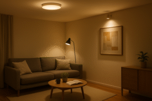
| 2700K | Warm White | Cozy, comfortable, welcoming, home-like. | Bedrooms, living rooms, hotel guest rooms. |
| 3000K | Soft White | Neutral, friendly, balanced, versatile. | Kitchens, bathrooms, lobbies, retail spaces. |
| 4000K | Cool White | Clean, focused, alert, energetic. | Offices, workspaces, garages, modern retail. |
| 5000K+ | Daylight | Intense, clinical, high-contrast. | Warehouses, hospitals, detailed inspection areas. |
Do Bold Colors Like Red or Blue Really Have a Place in Design?
You see smart bulbs offering millions of colors, and you write it off as a gimmick. You can't see a practical application for saturated red or green light in a serious design project for a home or business.
Yes, saturated colors have powerful psychological impacts and are used strategically in design. Red energizes and stimulates appetite, blue calms and promotes trust, and green reduces stress. They are used to influence behavior in specific commercial environments.

While shades of white light form the foundation of good design, using actual colors is a powerful tool, especially in commercial spaces. Color psychology is heavily used in branding and marketing, and lighting is an immersive way to apply it. The effect is subconscious but profound. As a B2B supplier, while your main demand might be for our high-quality white G4 and G9 bulbs, understanding these principles allows you to have more intelligent conversations with clients. It shows that you understand their business goals, not just your product specs.
More Than a Gimmick: Strategic Color Application
Using saturated color is not about flooding a room with a single hue. Instead, it's about strategic accenting2. A wash of blue light behind a bar, red uplighting on a feature wall, or green accents in a spa's water feature can completely define the space's brand and intended mood. It works by tapping into deep-seated emotional responses to color that are nearly universal across cultures.
The Emotional Power of Colored Light in Commerce
Businesses use this to their advantage every day. Fast-food restaurants often use reds and yellows to increase heart rate and stimulate appetite, encouraging customers to eat more and leave quickly. In contrast, a high-end bank or tech company might use blue accent lighting in its lobby to create a feeling of security, trust, and calm competence. They are using light to communicate brand values without saying a word.
The Subconscious Effects of Key Colors
Each color sends a distinct signal. Understanding these allows you to recommend specific solutions for specific business types, adding immense value for your customer.
| Color | Positive Associations | Negative Associations | Common Commercial Use |
|---|---|---|---|
| Red | Energy, passion, excitement, appetite | Danger, anger, intensity | Restaurants, bars, sale promotions. |
| Blue | Trust, calm, security, productivity | Coldness, sadness | Banks, corporate offices, spas, tech brands. |
| Green | Nature, health, tranquility, harmony | Envy, boredom | Hospitals, wellness centers, eco-friendly brands. |
| Yellow | Happiness, optimism, warmth, creativity | Anxiety, caution | Creative studios, fast-casual dining, retail windows. |
Why Do Colors Look Lifeless Under Some "Good" LEDs?
You install brand new LEDs that have the perfect color temperature, but the room's decor looks dull. The rich red sofa looks brownish and skin tones look unnatural, making a beautiful space feel cheap.
This happens because of a low Color Rendering Index (CRI). CRI measures how accurately a light source shows colors compared to sunlight. For vibrant, true-to-life color, you must choose bulbs with a high CRI of 90 or more.

This is a critical, yet often overlooked, aspect of light quality. Kelvin sets the mood, but CRI determines the quality and vividness of everything in the room. A bulb can have a perfect 2700K warm glow, but if its CRI is low (under 80), it's like listening to music with the bass turned off. The richness is gone. This is because a low-CRI LED is not producing a full spectrum of light. From a manufacturer's perspective, achieving a high CRI of 90+ requires better quality LED chips and phosphors. Many companies cut corners here. For our clients, specifying high CRI is a way to guarantee a premium result. It is a key pain point for retail and design customers that we solve by making high-CRI our standard.
Defining Color Rendering Index (CRI)3
CRI is a scale from 0 to 100 that measures the ability of a light source to reveal the true colors of objects in comparison to a natural light source (like the sun). Sunlight has a CRI of 100. The closer an LED bulb's CRI is to 100, the more accurately it will render colors. An 80 CRI is considered acceptable for general use, but for quality results, 90+ is the professional standard.
The Science of "Missing" Color
A low-CRI light source is literally missing certain wavelengths of the color spectrum. Imagine a light source that produces very little of the "red" wavelength. When this light hits a red apple, there is no red light to reflect back to your eye, so the apple appears dull, brownish, or gray. High-CRI bulbs produce a much fuller, more complete spectrum, ensuring all colors can be seen as they were intended.
When High CRI is Not Negotiable
For some applications, high CRI4 is absolutely essential. Any buyer or product manager dealing with these industries must prioritize CRI to avoid client disappointment.
- Retail: Especially for fashion, cosmetics, and furniture. Accurate color is a direct driver of sales.
- Art Galleries and Museums: To ensure artwork is viewed exactly as the artist intended.
- High-End Residential: For interior designs that rely on a specific, subtle color palette.
- Restaurants: To make food look fresh, appetizing, and delicious.
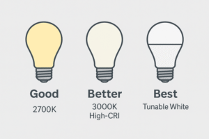
How Can I Offer These Benefits Without Overwhelming My Customers?
You understand the power of color psychology, but you fear that offering too many options will confuse your clients. A huge catalog of choices can lead to "analysis paralysis," causing them to stick with what they already know.
Focus on a "good, better, best" strategy. Offer a high-quality standard (2700K), an improved option for clarity (3000K with High CRI), and a premium solution with user-controlled tunable white technology for ultimate flexibility.

This is the key to turning advanced knowledge into a practical sales strategy. You don't need to stock every Kelvin and color. Instead, you guide customers with curated solutions. I advise my clients, like product managers in the UK and Netherlands, to structure their offerings this way. By framing the choices around the benefits (cozy, clear, or flexible), you make it easy for your customers to choose the right product. This approach simplifies their decision-making process and positions you as a problem-solver who understands their needs beyond the technical sheet.
The "Good" Solution: The Warm Standard
For most residential and hospitality applications, a high-quality 2700K bulb is the perfect baseline. It delivers that consistently warm, cozy, and inviting light that feels like home. This should be your reliable, go-to product that satisfies a large portion of the market and provides an excellent, cost-effective solution. At Omita, this is our bread-and-butter, and we ensure exceptional quality even at this standard level.
The "Better" Solution: Clarity and Vibrancy
Your next tier should focus on solving the CRI problem5. Offer a 3000K bulb with a guaranteed CRI of 90+. This provides a slightly more neutral, but still welcoming, light that makes colors pop. This is the ideal upsell for kitchens, bathrooms, high-end closets, and commercial retail spaces where color accuracy directly impacts the user's experience and satisfaction. You are selling "true color" as the benefit.
The "Best" Solution: Ultimate Flexibility
The premium tier is tunable white technology6. These are bulbs or fixtures that allow the user to change the color temperature themselves, typically from a warm 2200K up to a cool 4000K or 5000K. This allows a single space to serve multiple functions perfectly. A home office can be a bright, 4000K-lit productive workspace by day and a warm, 2700K cozy den at night. This is the ultimate solution for flexibility and modern living.
Conclusion
Light color is not decoration; it's a powerful psychological tool. Use warm whites for comfort, cool whites for focus, and high-CRI bulbs for clarity to master any space's atmosphere.
-
Exploring circadian rhythms can help you optimize your lighting choices to improve well-being and productivity. ↩
-
Explore this link to understand how strategic accenting can enhance your space's brand and mood effectively. ↩
-
Understanding CRI is crucial for selecting the right lighting for various applications, ensuring colors are rendered accurately. ↩
-
Exploring the significance of high CRI can help you make informed decisions for lighting in retail, art, and more. ↩
-
Understanding the CRI problem is essential for choosing lighting that enhances color accuracy and user satisfaction. ↩
-
Explore tunable white technology to discover how it can transform your space with customizable lighting solutions. ↩